
Website Research
- May 2, 2017
- 2 min read


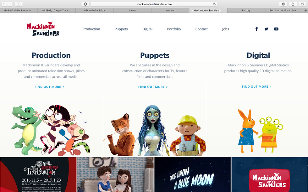

The website's that I have chosen to research are:
Aardman
Laika
Mackinnon and Saunders
Factory-Create
Seconds-that-Count
Each website uses a clear grid system, to help guide the viewer's eyes around the page. Animation websites often use grids of 3/4 across as it helps them to display more work to the viewer at once, offering a variety of links for the viewer to click. These 5 websites that I have researched also often place the writing central in the screen when there is an important piece of information such as the Aardman Academy page, a title page or an explanatory paragraph about the company. This shows that the central piece of writing/imagery is aimed to be the centre of attention for the viewer.
When it comes to branding - Laika, Aardman and Mackinnon and Saunders have a similar professional feel to their websites. They clearly show top brand quality and a possess an experienced skilful quality. However Laika's website is mostly black and white, giving it a bright and modern feel, whereas Aardman and Mackinnon & Saunders contain a red, black and white theme with frequent mixes of brightly coloured photographs of their work to liven up their professional looking theme. Compare this to Laika's subtly toned images that they chose to display and Laika seems much more reserved and mature than the other two websites. Despite this difference, the 3 websites remain to have a similar brand feeling. Factory has an extremely child-friendly branding - perhaps because most of their productions are targeted at children. They have lots of bright primary colours and a yellow/green/black core colour theme. Mackinnon & Saunders do use these colours occasionally but it is more shown through their photographs of their puppets and not their branded website colours.
Seconds-that-count are definitely the sore thumb when it comes to branding styles. As there are very few crossovers with the other websites. The studio has a modern-homemade vibe but gives off a much less professional branding than that of the larger studios. This is perhaps due to the informal presentation that the font, logos and styles have. I feel that this studio is much more personal for small scale projects than the others.


Comments